

A Path to Manhood Cover Reveal
A Path to Manhood Cover Reveal
Check out the cover design for my fifth title, coming February 2025 from North Country Books.

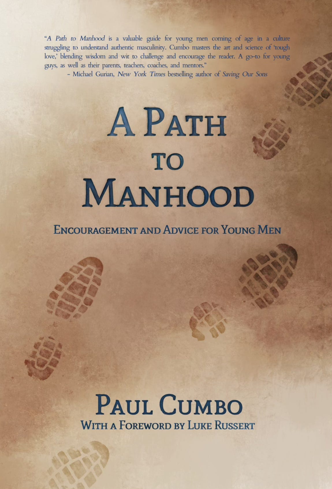
I’m excited to share the cover design for A Path to Manhood: Encouragement and Advice for Young Men. It’s scheduled for release in February 2025 through North Country Books, and will be available for pre-order this fall.
The cover features artwork by my brother David, a remarkably skilled professional illustrator and animator. Get this: way back when he was in college at the Art Institute of Pittsburgh, his animated short Fragile was a finalist for the Student Academy Awards. Since then, he’s worked for a slate of creative companies, including Fisher-Price and Insomniac Games. Hand the guy a pencil and a scrap of paper and he can render a photorealistic image of just about anything in a few minutes.
North Country has its own talented cover designers, of course. But ever since Dave did the cover art for my first novel, Boarding Pass, he and I have had a great arrangement: He does my covers; I edit his scripts and copy. We drive each other crazy, particularly in the later stages of fine-tuning each other’s respective projects, but in the best way – two very different artists working together at the intersection of our respective crafts.
When Jake, now my editor at North Country, first approached me about acquiring the manuscript, it didn’t take me long to pose the question: How would you feel about my brother doing the cover? Now, normally, if an author suggests having a family member or friend do the cover, I have to imagine an editor’s mind starts scrambling with how to shut the idea down politely. But I assured Jake that Dave was the real deal. I showed him my other book covers, and he was open to it. And as soon as he saw the concept we had in mind, he was all in.
Of course, we didn’t get to this one immediately. Initial ideas for the cover were predictable. I sketched a number of concepts, nearly all of which featured – wait for it – a guy walking on a path. But no matter how many ways I tried to visualize it, it ended up too much like the covers of my two novels, Boarding Pass and Wilderness Therapy.
We needed something that felt masculine – but I didn’t want anything that came across as too muscular or imposing. I didn’t want something that sounded like an imperative to ‘man up,’ issuing forth from the man-o-sphere. But on the other hand, I also didn’t want something that smoothed over all the rough edges of masculinity.
Most importantly, the cover needed to convey the journey motif. There’s something about the bootprints on the rugged terrain that landed well, and we went with it. It was a great reminder that sometimes less is more, and the simple image wins the day. Hope you like it.
Stay tuned for a future post or podcast episode featuring a conversation with Dave about our collaborations on all five of my book covers. Meanwhile, check out his website.
Also, watch this space for a post about how Luke Russert and I connected. He’s graciously accepted our invitation to write the foreword, and I’m excited to be collaborating with him.
If you think this book looks cool, please help me out by telling people about it. Subscribing to my Substack is definitely the best way to stay in the loop. Thanks!